The Color of the Year 2024: Comfort, Versatility, and Nature
Color plays a significant role in design and fashion. It can evoke emotions, set the mood, and even communicate brand identity. Every year, various paint and design companies name their Color of the Year, highlighting the latest trends in color. These selections often kickstart new design trends and inspire creativity among artists, designers, and fashion enthusiasts. As we approach 2024, the Color of the Year picks emphasize a shift toward comfort, versatility, and nature.
At Benchmark Painting & Carpentry of Boynton, FL, we take great pride in staying up-to-date with the latest color trends and incorporating them into your projects.
Let’s take a closer look at the top 10 Color of the Year selections for 2024:
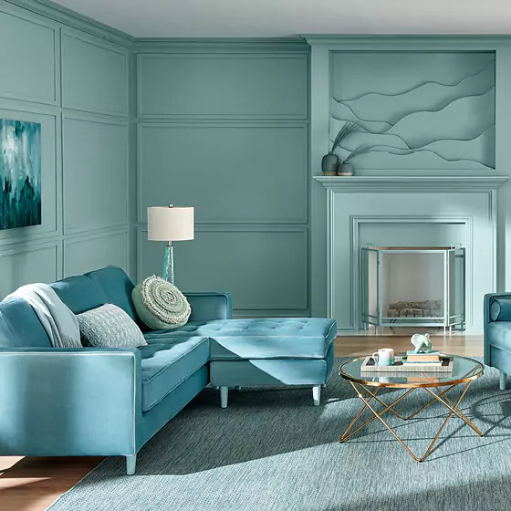
Exploring Benjamin Moore’s Blue Nova (825)
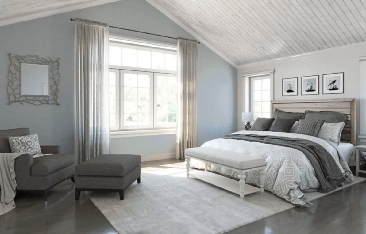
Benjamin Moore: Blue Nova (825)- This blue hue represents stability and calmness, reminiscent of endless skies and serene water bodies. It pairs well with soft pastels for a calming atmosphere in a living room or bedroom.
Are you already dreaming about the hues that will take over your home decor for the next few years? Then you won’t be disappointed by Benjamin Moore’s Blue Nova the Color of the Year for 2024, and it’s set to make a major impact on interior design trends for years to come. This captivating shade of blue is the perfect blend of calming and invigorating, making it ideal for any room in your home where you want to create a soothing yet stylish atmosphere. From bedrooms to living rooms and even kitchens, Blue Nova is a versatile hue that can complement a wide range of design styles.
Unveiling Behr’s Cracked Pepper (PPU18-1)

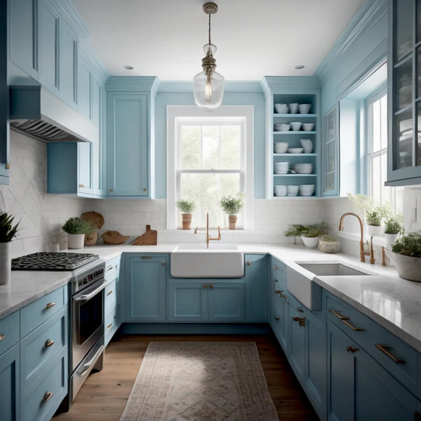
Sherwin-Williams: Upward (SW 6239) – This light blue-green represents growth, optimism, and positivity, reminding us of clear skies and open spaces. It pairs well with warmer colors like earthy browns or mustard yellows.
Say hello to Upward. This soft, serene shade of blue is the perfect hue to help create a calming space that inspires relaxation and reflection. It’s no wonder why Sherwin-Williams chose this color to represent the year ahead. Upward symbolizes the hope, optimism, and trust we all need, especially after the challenges of the past two years. Whether you’re painting a nursery, a living room, or your bedroom, Upward is sure to create a beautiful and soothing ambiance that you’ll love coming home to.
The Infinite Potential of Glidden’s Limitless (PPG1091-3)
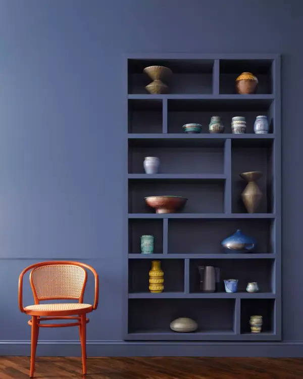
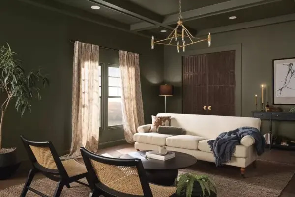
Glidden: Limitless (PPG1091-3) – This warm gray represents balance, versatility, and harmony, representing the perfect blend of masculine and feminine energies. It’s a great color for a home office or a library, pairing well with leather or wood furniture.
Glidden has outdone themselves once again with their latest Color of the Year announcement – Limitless. With this bold and vibrant shade, they’ve captured the spirit of what makes us all unique – the endless possibilities that exist within us. Limitless is a color that encourages us to take risks and think outside the proverbial box, reminding us that there are no limitations to what we can achieve. This deep and enriching hue brings a sense of energy and enthusiasm to any space – whether it’s a living room, bedroom, or office. So, let’s embrace our individuality, break down the barriers, and unleash our true potential with this inspiring color.
Embracing the Warmth with C2 Paint’s Thermal (752)
C2 Paint: Thermal (752) – This off-white color represents calmness, simplicity, and purity. It’s a perfect choice for a bathroom or a nursery, or any room that requires a serene and cozy atmosphere.
As the weather grows colder, nothing is more comforting than being surrounded by warm, cozy hues. Fortunately, C2 Paint’s Thermal collection has a plethora of colors that capture that feeling of warmth and contentment. From the velvety richness of Cocoa to the rustic charm of Mahogany, this collection allows you to create a space that radiates comfort and calm. Whether you’re painting an entire room or just adding a pop of color, the Thermal collection is sure to inspire you to embrace the chill of the season and create a space that is both inviting and chic. So why not grab a cup of cocoa, curl up on the couch, and start dreaming up ways to make your space as snug as possible?
Refreshing Spaces with Valspar’s Renew Blue (8003-37D)
Valspar has officially announced their Color of the Year, and it’s none other than Renew Blue. This stunning shade of blue is a perfect representation of the optimistic and hopeful outlook for the upcoming year. It is a color that brings a sense of calmness to the mind and uplifts the spirit. Renew Blue is a sign of a fresh start, new beginnings, and endless possibilities. Whether you’re looking to freshen up your interiors or add a pop of color to your exteriors, Valspar’s Renew Blue is the perfect choice to revitalize your living spaces. So why not embrace the Color of the Year and turn your home into a peaceful retreat with the help of Benchmark Painting & Carpentry of Boynton, FL?
A Touch of Elegance with HGTV Home by Sherwin-Williams’ Persimmon (HGSW6339)

HGTV Home by Sherwin-Williams: Persimmon (HGSW6339) – This bright orange hue represents energy, enthusiasm, and vitality, reminding us of warm summer days or fiery sunsets. It pairs well with cooler colors like blues or grays, adding a pop of color to a neutral living room or dining room.
When it comes to choosing the perfect color for your home, Sherwin-Williams is a trusted name in the business. Recently, their HGTV Home line selected the vibrant shade of Persimmon to add to their color collection. This bold hue is sure to make a statement in any room, creating a warm and inviting atmosphere. Whether you use it on an accent wall or throughout the entire space, Persimmon is a versatile color that can enhance any design style.
The Strength of Dutch Boy Paints’ Ironside (422-7DB)
Dutch Boy Paints: Ironside (422-7DB) – This deep, warm brown represents stability, protection, and comfort, evoking the feeling of a warm fireplace or a cozy cabin in the woods. It pairs well with blues or greens, adding a masculine touch to any room.
When it comes to choosing the right paint, Dutch Boy Paints knows a thing or two. That’s why their latest choice, Ironside, is getting a lot of attention. This paint is designed to withstand the toughest conditions, making it perfect for both interior and exterior use. Its durable formula can resist chipping, peeling, and fading, ensuring that your walls will look as vibrant as the day you painted them. Plus, Dutch Boy Paints has a wide range of colors to choose from, so you can find the perfect shade to match your style. If you want a paint that lasts, Ironside is the way to go.
Diving Deep into Minwax’s Bay Blue (MW1049)
Minwax: Bay Blue (MW1049) – This Mediterranean blue represents tranquility, relaxation, and escape, reminding us of warm sandy beaches and crystal clear waters. It pairs well with cool whites and grays for a refreshing and soothing look in a bathroom or a bedroom.
Get ready to add a pop of color to your furniture and woodwork. Minwax, a leading brand in wood finishing and staining, has chosen Bay Blue as their Color of the Year. This bold and refreshing shade is the perfect balance of calm and energy, making it an excellent choice for those who want to add a little bit of personality to their surroundings. Whether you’re refinishing a table or sprucing up your favorite wooden chair, Bay Blue will add a touch of elegance and modernity to any piece.
The Vibrancy of Graham & Brown’s Viridis (121592)
Graham & Brown: Viridis (121592) – This lush green represents renewal, growth, and healing, evoking the feeling of being surrounded by nature. It pairs well with neutral colors like whites or grays, adding a refreshing touch to a living room or kitchen.
The future is looking bright and green for Graham & Brown’s Viridis. This shade of green symbolizes growth, renewal, and environmental consciousness, making it a perfect choice for the upcoming years. With sustainability becoming a more pressing issue in our world, it’s no surprise that companies are starting to prioritize eco-friendliness in their brand messaging.
Wrapping Up Our Colorful Journey
The Color of the Year selections for 2024 reveal a trend towards comfort, versatility, and nature, as we navigate a world that continues to change and evolve. These colors offer endless inspiration for designers, artists, and fashion enthusiasts, providing a fresh take on existing trends or inspiring entirely new ones. Let’s embrace these latest color trends and allow them to inspire us to create beautiful and functional spaces that reflect our individual styles and personalities.
Already feeling inspired? The professionals at Benchmark Painting & Carpentry of Boynton, FL are ready to help bring your dream space to life with a fresh coat of any of the stunning colors mentioned. After all, design is about finding harmony and balance, just like these colors do.