Paint Color Psychology for Retail Spaces and Customer Behavior
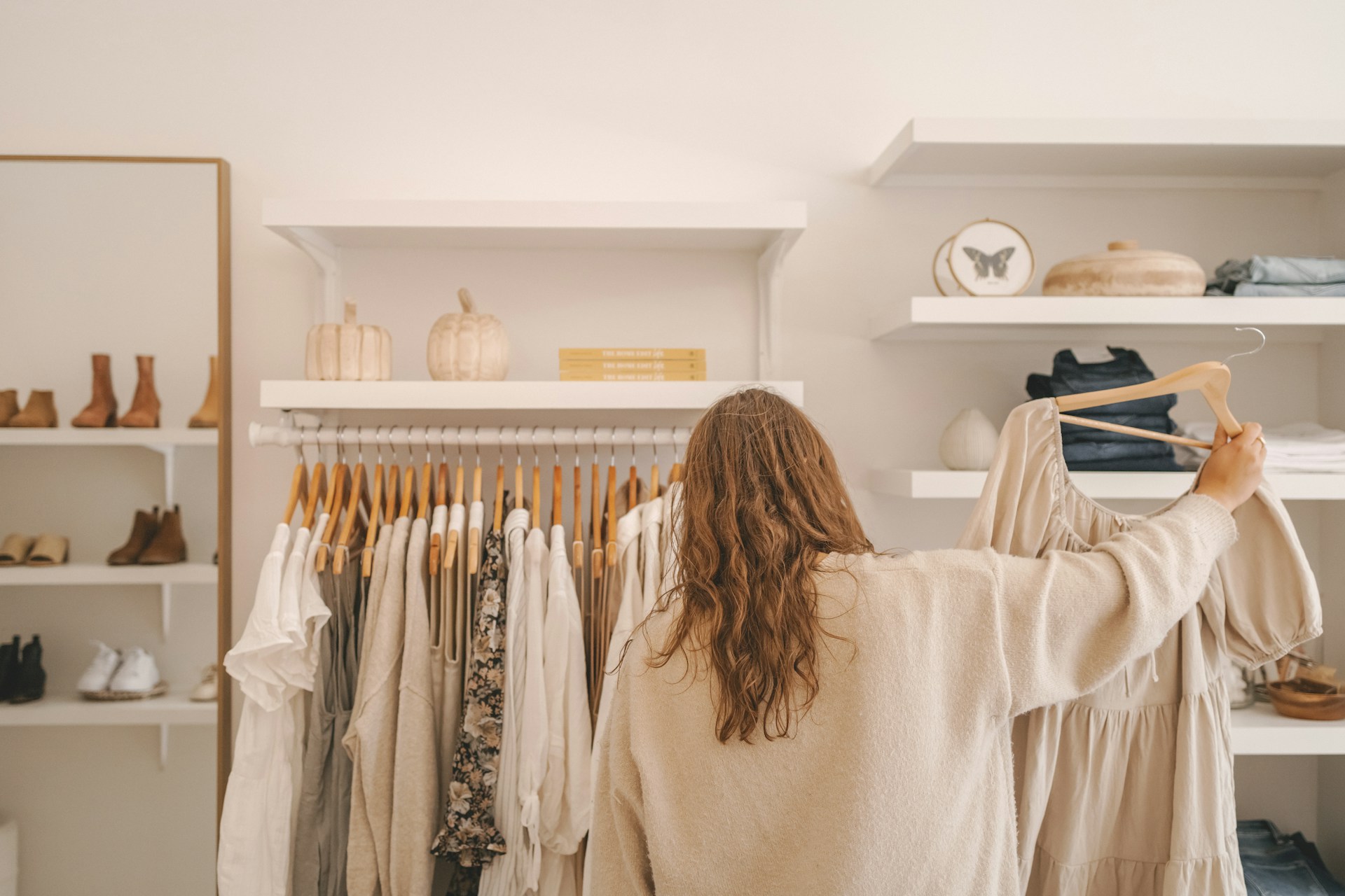
When customers step into a retail space, they begin forming opinions before anything is said or sold. The layout, lights, and wall colors all speak clearly without a word. While most retailers focus on branding, signage, and displays, paint colors can have just as much influence over how people feel and how they shop. The color of the space can affect mood, movement, and even the likelihood of a purchase. That makes color psychology a powerful tool for shaping the customer experience.
For business owners, especially those managing retail property in Boynton Beach, knowing how paint colors impact behavior can go a long way. A well-designed space with the right palette helps shoppers feel invited and comfortable and keeps them browsing longer. Whether it’s bold shades for excitement or muted tones for calm, paint can do more than decorate a wall. It plays a behind-the-scenes role in how buyers connect with your products and your space.
The Basics Of Color Psychology
Color psychology is the study of how colors affect behavior and emotions. While individual experiences and cultural backgrounds can shape color preferences, some general emotional responses to color are commonly shared. When used strategically in a retail setting, these emotional triggers can guide how customers interact with the space and products.
Here are a few common color effects to keep in mind:
- Red: Brings out urgency and excitement. Often used to promote sales or call attention to special items.
- Blue: Creates a relaxed and secure feeling. Lighter shades make spaces feel more spacious and calming.
- Yellow: Invites warmth and happiness. Works well near checkout areas or entryways for a cheerful vibe.
- Green: Tied to balance and freshness. Great for promoting eco-friendly products or setting a peaceful tone.
- Black: Adds sophistication when used in moderation. Too much can feel heavy or closed off.
- White: Makes an area feel clean, open, and simple. Often a great base for adding colorful accents.
Even these basic responses reveal how much of an influence color has. Customers don’t think about it consciously, but they often spend more time and feel more at ease in spaces where the colors reflect the type of experience you’re trying to create.
Choosing The Right Colors For Your Retail Space
Picking colors isn’t just about taste. It should reflect your brand’s style, the kind of products you offer, and the emotions you want your customers to feel. The type of business you run and the layout of your space also make a big difference when making color decisions. A boutique selling handmade items might go for soft earth tones that feel relaxed and homey, whereas an electronics store might need cooler tones like blue or gray to match a sleek and modern look.
Here are some ways to select colors that align with your store’s goals:
- Match your brand identity. Let your logo or primary brand colors guide your paint choices.
- Consider your target audience. Younger shoppers may respond better to vibrant or trendy colors, while older customers may prefer something classic and subtle.
- Use color to divide or highlight areas. Try deeper hues around feature walls or product displays to draw attention while keeping the rest of the space neutral to avoid overload.
- Think lighting. Natural light can alter how a color truly looks. Always sample paint on-site before committing to it.
Accent colors are your secret weapon. These are bolder colors used in smaller areas, like wall trims or display sections, that can shift the mood without overwhelming the space. A bright teal around the sampling station or a burnt orange wall in the lounge can impact the overall atmosphere while keeping the main color scheme focused and calm. These choices should feel intentional, guiding people through the space while setting the right emotional tone.
Enhancing Customer Experience With Color
Colors affect more than how a space looks. They guide how people feel and move through it. When used on walls, ceilings, and accent areas, certain shades can build trust, trigger emotions, or even speed up the decision to buy. Think about how you want your space to feel from the moment a customer walks in. Are you aiming for a peaceful environment that encourages browsing? Or do you want to stir up energy and excitement in a high-volume retail space?
The right color placement can also help create focus in specific areas. Strategic color use can encourage shoppers to slow down in certain spots, like around new arrivals, sale items, or seasonal displays. Even the paint in dressing rooms can influence how long someone tries on clothes and whether they walk out with a purchase.
A few helpful ways to support the customer experience using color:
- Use warm tones like soft yellow, coral, or peach near the front entrance to make people feel welcome.
- Paint walls behind product displays in a subtle contrast color to highlight featured items.
- Stick to lighter tones in narrow aisles or low-ceiling areas so they feel more open and less crowded.
- Apply calming colors like light gray or blue near registers or service counters to reduce tension.
- Use darker shades near checkout counters or back walls to subtly guide traffic in the right direction.
Every inch of a retail space has purpose, and color helps define it. Picking the right palettes invites customers to stay longer, pay attention, and feel at ease, which often leads to higher satisfaction and better sales.
Practical Tips For Using Color Effectively In Retail Spaces
Putting color psychology into action means thinking beyond the swatch. It’s more than choosing random colors you like and painting away. You need a plan that works with your business goals, floor layout, lighting, and what you’re selling.
Here’s how to make smart, effective color choices that bring a retail space to life:
- Start with a purpose. Do you want to calm down busy energy? Show off luxury? Encourage quick decisions? Answering that helps lead your selections.
- Sample paint on your actual walls. Light, especially in South Florida, changes how colors look throughout the day.
- Don’t paint everything the same color. Use neutrals for balance and bold colors to add interest or direct attention.
- Combine no more than three or four paint colors in a space. Too many colors can create confusion or visual noise.
- Pay attention to product display colors. Bright clothes or packaging may look better against simple backdrops rather than colored ones.
Know when it’s time to call professionals, especially when you’re refreshing a large commercial space. From testing paints to getting an even finish, experienced painters can make sure the job doesn’t just look good now but keeps working for your store in the long run.
Refreshing Paint Colors With Each Season
Boynton Beach has a tropical climate that gives locals and visitors plenty of sunshine year-round. Still, small seasonal shifts provide a good opportunity to refresh some interior colors. It’s not about repainting the whole space every few months but about finding small ways to keep things feeling new and timely.
When summer winds down and early fall rolls in, right around late August, colors that feel cozy and grounded begin to make sense. Think soft terracotta, taupe, muted navy, or clay-toned accents that signal a subtle shift from tropical summer brightness into a more relaxed, early-autumn feeling.
Here are easy seasonal paint touches that don’t require a total makeover:
- Add a fall-toned accent wall behind your checkout or display area.
- Update shelf backdrops or nook areas with darker or moodier shades.
- Refresh trim or entryway paint with toned-down neutrals like clay or storm gray.
- Match painted elements with seasonal props. Display changes feel more intentional that way.
Color sets the tone even before a customer speaks to a salesperson. When it reflects the time of year, it keeps the store feeling thoughtful and well-maintained, which shoppers notice even if they don’t say so aloud.
Why Thoughtful Color Choices Make a Big Difference
Paint color does more than decorate a space. It creates the setting for your customer’s overall experience. From the first impression when they walk in, to how they move through the store, to how long they stay, color helps shape the mood and flow. Picking the perfect shades takes more than choosing your favorite tones. It takes an understanding of how color affects behavior, and how that behavior impacts sales.
Being intentional with paint is a smart move for retail business owners in Boynton Beach. Whether you’re introducing soft seasonal accents or going for a full interior update, make sure your color choices reflect what your brand stands for and how you want people to feel in your space. Even simple changes can make a big difference over time.
The right paint choices can shift emotions, increase comfort, and support the kind of environment where people enjoy spending time and where they’re more open to making a purchase.
Transform your retail space with the right colors to create an inviting atmosphere that resonates with your brand and customers. If you’re considering a new look or refreshing your current design, working with experienced professionals can make a significant difference. Trust Benchmark Painting as your go-to commercial building painters to ensure your space not only looks great but also fosters the right experience for your customers.